
10th June 1998, Discussion topic : Patching the FF interface ...
The recent discussion of patching the FF plug-in to change the size of the
code fields got me thinking of something I was trying a while ago. I wasn't very
happy about the size / layout of the FF dialog box itself in the compiled filters.
If you used ALL the sliders in your filters then it wouldn't look too bad, but if you only
used one or two sliders then the dialog box would look a bit odd. I would have prefered
the sliders to be underneath the preview window to start with.
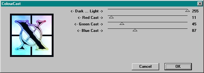
ORIGINAL INTERFACE :
This was the original interface created by Filter Factory. Notice the "blank" grey areas when you don't include all the sliders in a filter. I don't like this. Plus, if you're working at standard 640 x 480 res the dialog box is slighty too long to fit on the screen.

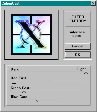
UPDATED INTERFACE :
Using a resource editor (I used Borland Resource Workshop here), you can open a FF-created filter and edit the dialog boxes. I wanted the sliders underneath the preview window so that the dialog box would fit on screen better. I also added beveled boxes just to make it look nicer!

I also tried changing the dialog layout in the original FF plug-in itself, but
you would need a variety of versions to cater for how many sliders you were using
for each filter. Could be done I suppose, but didn't bother to pursue this.
Does anyone have any ideas on how to tidy up the FF interface a bit? Anyone else
tried any experiments with this? if you have any comments or ideas on this subject
then please get in touch
This seemed to work fine to begin with, but sometimes the filter would refuse to
work (the dialog box would not appear). Couldn't figure out what was doing it so
abandoned the experiment! Probably doesn't like you trying to patch it this way.
 |
 |
 |
 |
 |
 |
 |
